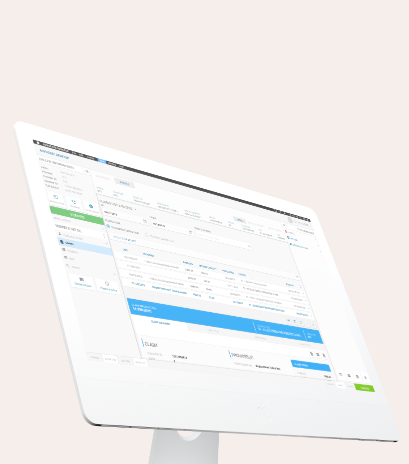
ADVOCATE DESKTOP APP
ABOUT: The details
The Advocate Desktop app is a digital solution aimed at helping Customer Service Reps (CSR) manage their members, streamline communication, and enhance overall member relationships. This case study focuses on the user experience (UX) design process involved in creating the Advocate Desktop app.
The primary objective of this project was to develop an intuitive and user-friendly client management app that allowed the CSR to organize and track member information, communication history, and relevant documents. The app needed to provide a seamless user experience, improving productivity and enabling effective member management.
WHY: The problem
The CRSs were using up to 10 different apps and personal tools as well as some internal websites to surface the relevant information to assist the clients and members that called in. One of the larges problems is that none of the tools and apps talked to each other despite that fact that they were own and operated within the company. Because of the multitude of tools and disconnected information CSRS were taking too much time finding the relevant details need to satisfy the members needs.
HOW: The solution
Through a multi-discipline effort we brought together the multitude of tools together into a few APIs that fead a single UI. This allowed the CSRs to focus on the members specific needs and not be distracted and confused by the back and forth of using multiple tools.
WHO: The team
The team was lead by the Principle designer and guided by the Sr UX/Product designer. Engineers,

Research Phase:
User Research:
To gain insights into the target audience's needs, preferences, and pain points, user research was conducted through interviews and surveys with business professionals involved in client management.Competitor Analysis:
A comprehensive analysis of existing client management apps was performed to identify their strengths, weaknesses, and areas for improvement.Feature Prioritization:
Based on user research and competitor analysis, a list of essential features was identified. This list included client profile management, communication history, document storage, task management, and reporting capabilities.
A little bit more about the discovery process
Qualitative Research
Methods: Interviews, Observations & User testing
Within this research method I was able to discover:
What the overall purpose of the tool should be.
• What the most effective data visualization should be.
• What the most efficient user journey would be.
• How each separate tool would be most efficiently connected.
• How the department interacted with the other.
• The most common types of interactions.
• The most common reasons for a less than positive iteration.
Quantitative Research
Methods: Analytics, Surveys & Correlative research
Within this research method I was able to discover:
The number of CSRs that operated remotely vs. on campus.
The number of calls in a day, hour per CSR.
The average call time.
The average call time based on topic.
The average call topics
What is most important to the average caller.
What the average complaint users have after calling in.
The top research results
Too long
Users want to be able to enter the relevant information into once place and have it populate through out the multiple tools. This would shorten the process of answering callers questions.
Real time
Users want to be able to monitor the status of cases in real time.
Search History
Users want to be able to search for cases based on relevant history and interactions.
Authorizations
Knowing who is authorized to discuss relevant information carries a great deal of weight. Having this information available without having to do a deep dive would be incredibly valuable.
The journey
Wireframe:
Users want to be able to enter the relevant information into once place and have it populate through out the multiple tools. This would shorten the process of answering callers questions.

Design Phase:
Information Architecture:
The app's information architecture was designed to ensure easy navigation and discoverability of key features. A clear and intuitive hierarchy was established, organizing client information into logical categories and subcategories.Wireframing:
Low-fidelity wireframes were created to visualize the app's structure and layout. These wireframes focused on the core functionalities, ensuring a smooth flow of information and actions for users.Visual Design:
A clean and professional visual design was adopted, aligning with the client's branding guidelines. The color palette, typography, and visual elements were carefully chosen to enhance readability and visual appeal.Prototype Development:
A high-fidelity interactive prototype was developed using a prototyping tool, allowing stakeholders and potential users to experience the app's functionality and provide feedback for further refinement.